PAYPAL
What was going on.
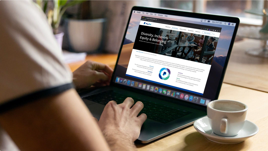
PayPal's diversity and inclusion content was scattered across roughly 12 pages and three subdomains. Worse, it wasn't accessible and for the group responsible for inclusivity, this was not a good look.
PayPal needed a focused presentation for no less than 4 distinct user groups: customers, partners, employees, and stakeholders. It had to tell the story of PayPal's commitment to Diversity, Inclusion, Equity & Belonging (DIE&B) while being WCAG 2.1AA compliant.
How we solved the problem
The right call was to start competitor research to see how the industry was presenting this information. Our team offered content and UX recommendations with the knowledge we had to stay within established brand guidelines and adhere to an existing Content Management System.
Once the strategy was set, our muti-disciplinary team trimmed the content down to just two pages, one focused on DIE&B, the other Supplier Diversity. Working with the brand team, we provided new language and imagery to meet PayPal's revised brand guidelines, tone, and core values. The new pages were designed and coded in a modular fashion that made CMS integration much easier for their development team
Go deeper
UX + Wireframes
Unifying content scattered across multiple pages and domains was job one. Our competitor analysis uncovered best practices and helped define the new IA for the section. Wireframes were used to gain alignment on the structure and messaging hierarchy before design started.
Copywriting
Consolidated disparate content from multiple sources was next on the list ensuring a unified voice, tone and message.
Infographics
A clean, brand-consistent way to visually represent PayPal's diversity data was key to user understanding, so we created infographics with simple animations, ensuring proper WCAG-compliant contrast ratios for the text and graphics and screen reader compliant alternative text.
Webpage design + development
While PayPal's Brand team continued to work on their new style guide, our task was to ensure these new pages adhered to the existing style and design patterns used within the primary corporate site. We utilized inclusive photography and Accessibility best practices to create a design consistent with the current site's look & feel.
Once approved, we created standards- and WCAG-compliant modular code for integration into PayPal's CMS tool.
See the work
Feel like working together? Reach out


